surfresearch.com.au
 |
surfresearch.com.au
bob
cooper : colour, 1980
|
Cooper
on :
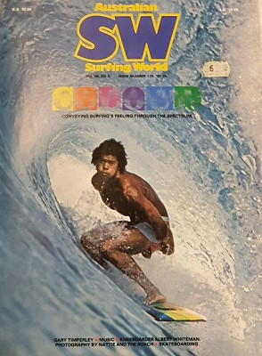
COLOUR
Conveying Surfing's
Feeling
Through the Spectrum.
|
Cooper on :
COLOUR
Conveying
Surfing's Feeling
Through the
Spectrum
1.
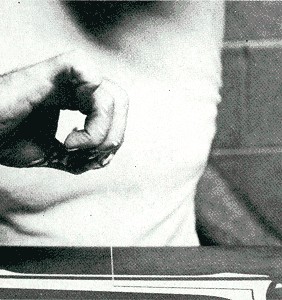
COOPER PERUSING HIS PINLINING PASSION
|
|
Probably because
of my personalisation of my own equipment and having a sort
of basic art
background, the rhythm and the colour of surfing, the people
and everything else in it, I feel, could be tied in with the
actual surfboard design and colour.
The overall effect
of this would be a unity reflecting the personality or aims of
the individual.
I guess what
really pressed my button on this idea was the fact that
when I was learning to surf the only book on surfing was
"Surfing in Southern California" by Doc Varle.
You'd see the
huge redwood boards all lined up, like the "San Onofre
Club posing", the "Paddle Board Club posing", with these huge
boards behind them like an immense picket fence.
And the boards were personalised.
They were all home-made, because there was no commercial
manufacturing, guys would take their time and sign their
work of art.
Like a painting they'd put a specific insignia on it, or
a picture of a beautiful girl, or something similar.
This meant the thing that they'd probably taken months
to glue up and carve out was made even more personal.
They got their idea from the
early Hawaiians who of course did the same thing except
they actually had a name for their board, that's how
personal it was.
George Downing had one called "Pepe", he's still got it,
the name "Pepe" is inlaid in mother of pearl on the nose
of it.
On one of my first trips to
the Islands we went into Wally Froseith's basement and
there hanging on the roof underneath this house were all
these old boards and he had names for every one of them.
I always remember one named "Sampan Row" and I asked him
where that originated and he said:
"Well, the biggest surf that you get is Outside Castles
(Waikiki) and it's so big out there that the sampans,
when they come out of Honolulu, are just passing outside
the break".
So that's the name Sampan Row, it was a big board
reserved strictly for riding big, big Outside Castles.
I just thought that was great and I loved the way the
words kinda roll off your tongue
It appears to me what happened was, when guys were
making their own boards, the time involved with this
project brought them a lot closer to the product, to the
point where there was actually a relationship
established.
It would take so long to
carve out a redwood or a balsawood board that the
prolonged involvement with this object would give you a
feel or a name for it.
By working at it on a day to day basis a sort of a
relationship would be established to the point where it
became almost an identity.
This personalisation
disappeared because we buy' em commercially now, made by
other people.
It's a product, which gives it a bit more of an
inanimate feel and yet everybody knows that after surfing
a board for a period of time, there is something that
becomes established between you and the board.
Everybody has or has had a
good board that they really liked.
Suddenly, when it's stolen from them, it's a definite
loss, it becomes a possession of some unknown
personality.
There's a tremendous sense of loss and not just for the
value of the board, it's for the time involvement - the invested good times that
you've spent with this friend and the good times that
this friend has provided for you.
Somewhere in the South Bay
area of California, Hemlosa, Huntington or Redondo, in
somebody's garage in somebody's corner is the
original pig board.
Now the story on the pig
board is that Velzy shaped a kneeboard, (or a
belly-board we called it in those days) for some
guy.
He gave it to the glasser and the glasser at that stage
was kind of experimenting with putting names on boards,
trying to give them a little bit of 'colour' because
everything was that same balsawood colour.
He painted a picture of a pig standing on a board on it
and then he gave it to his brother to glass (they had a
partnership going).
The brother glassed the fin on the wrong end because
when the pig was painted it was going in the wrong
direction.
When the brother saw the pig he said "Okay, the pig is
facing the direction the board will travel" so he put
the fin on the other end.
|
THE NOSE
DECAL,
ALWAYS A MAJOR
VECHICLE OF
IDENTIFICATION
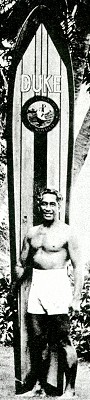
2. THE DUKE WITH NAME
AND SURFING CLUB
EMBLEM, circa
1930.
3. CHRIS BYRNE WITH
COMPANY
LOGO, circa 1979. -
Substitute
|
So because of the mistake of an
artist, the original pig board was born.
Bobby Patterson borrowed this board from a friend because he
thought he could stand up on it and as soon as he rode the
thing he just went haywire.
It's only recently, since boards have gone short again, that
the old pig principle, which is the principle of the widest
point behind centre has kind of faded out.
But the artistic tie-in is there with development history.
I remember also when I was just
learning, that you inevitably borrow everybody's board because
you can't afford one yourself.
Because they're everybody else's, you never get that feeling
about them, it would just be that some boards are better than
others.
But when you get your first board, the one that actually
belongs to you and that gives you the power to say "No you
can't borrow it, I want to go out now", there's something, special
about that board.
|
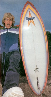
THE TWO
PIONEERS OF THE AIR BRUSH MURAL
ON AUSTRALIAN SURFBOARDS
4. MARTYN
WORTHINGTON WHO WITH
TERRY FITZGERALD CREATED A WHOLE
NEW IMAGE FOR SURFBOARD DECORATION HERE.
(Left)
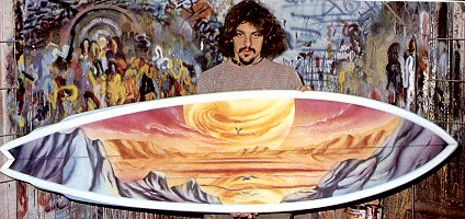
5. THE
WORK OF GOLD COAST BASED
SHANE EGAN, TRANSLATOR OF
FANTASY
AND IDEALISM. - Substitute
|
|
When I was young I borrowed
$20 from my father to buy this board and immediately sprayed it
with copper paint and painted a tiki on the nose of it.
I'd been practising these tikis for quite a while in school and
I had them down really perfect.
(I think that somehow or other affected my school grades too.)
So when the time came I put the tiki on the nose of the board in
black paint and it came out really good.
The next thing I did to give it a nice shine was to put resin on
top, because the copper (paint) had made it dull.
Two days later, the effect of the resin on the copper paint
tarnished the whole thing so that it was this metallic green
colour that you get when copper has been left in the elements
for quite a while.
With my beautiful tiki on the nose, frankly, I liked the effect
of it although it was very different from what I first
anticipated it would look like.
While coloured surfboards have been
around, even before fibreglass, as guys used to paint their old
redwoods and things with marine paint, it always takes a
somebody of major stature to give approval to a new trend
because it's also pretty much an indication of where the owner's
at.
Certainly the colour that Mark Richards evokes in his wetsuits
and his surfboard decor sets him apart from the ordinary surfer.
Even while he's standing on the beach, to witness this
tremendous display of colour before it even goes into the water
is to establish an identification that's easy to reacquaint as
soon as it drops
into a wave out there somewhere in the ocean.
|
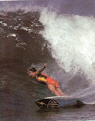
6. MARK
RICHARDS WITH HIS SUPERMAN 'MR' LOGO
- Substitute
7.
LARRY BERLTEMAN WITH HIS
GEOMETRIC DESIGN OF
LAST SEASON
|
|
Attention and
notoriety is obviously what you need if you're going to become a
professional surfer - you're going to want people to take notice
of you.
Fame and fortune do not come with anonymity, you have to be seen
and idolised.
If people are going to ask you to endorse their products it's
because of your ability to influence the thinking of others.
Somehow or another that genius the professional surfer has also
must be transferred to the consumer through a product
association, even if it's not a personal association: "Mark eats
Grumblies for breakfast and so do I".
Even though Mark has never
seen you and you've never seen him, you both do the same thing,
therefore there is a strong identification between Mark and
yourself.
When Australia got permission] to become a "World Power in
Surfing", initially through the international wins of Midget
Farrelly and Nat Young, the attitudes also changed in regard to
the fact that they could now become leaders and did not have to
remain followers.
This pervaded the surfing industry as well.
All board decals, when I first came
here in 1959-60, were direct rip-offs of long established
labels.
The departures from this copy cat tradition started to occur
after the wins of these two people, and they've continued.
As Australia grew
to become a world surfmg power, which it seemed to arrive at
five or six years ago, so did the individuality of it's
boardriders and designers.
The idea that "We don't have to follow anybody any more, we've
shown that we know as much as they do, we can now do our own
thing" is also manifest in the colours and in the decor of the
surfboards from this country.
On my last visit to California,
which admittedly was years ago, I was not impressed with their,
I guess colours, or decoration - the creative signature of
Californian surfboards was very subordinate, which also seemed
to reflect their position in the world surfing scene.
Whereas Midget Farrelly, in the old Brookvale shop, was
virtually screaming the superiority of Australian boards and
surfing and surfers in the colours and in the combinations and
in the finish of the boards that he was making at that time.
His impression on the market at that stage was so immense that
direct plan-shape, colour combination rip-offs were acceptable
as the only way that you could possibly compete.
This same shout of confidence is
reflected in the Terry Fitzgerald/Martin Worthington
combinations.
Although the airbrush on surfboard idea was not unique to Fitzy,
he brought the idea back I think, the end detail that was
delivered by the combination in the motifs and in the murals and
in the involved artwork, was definitely unique at that time.
It's only now being duplicated in various other parts of the
world.
I remember that tremendous feeling I had when I saw a
broken and battered Hot Buttered that had obviously come off
second best with the rocks at Kirra, sitting in the used and
destroyed board racks of Goodtimes (Surfboards) in a Kirra.
On the bottom of this thing was this gorgeous mural with huge
dents and scrapes and shatter marks and dirty wax all over it.
I thought to myself what a tremendous crime that this piece of
artwork was now going to be resigned to the junk-yard somewhere,
hopelessly unrepairable.
It had the signature of good art, you knew that it was an
original, that someone had taken a lot of time with rhythm, the
composition and the flow.
It was all there.
And it was very disappointing, the feeling I had in the pit of
my stomach when I saw it there just destined for the junk-pile.
Surfboard art, I guess, really has
to be throwaway art because of the nature of canvas - foam and
fibregiass eventually deteriorates, and there's nothing you can
do about it.
 |
9. COLOUR
JUNKIE TERRY FITZGERALD ALWAYS DRAWING THE NEON
LINE.
THE RAINBOW HAS
PROVIDED INSPIRATION FOR A UNIQUE HOT BUTTERED
IMAGE.
- Substitute |
Every kid who's
ever paid to have the masterwork, of a Worthington or a Wolf
or an Egan or someone else's abilities on the bottom of his
board, I'm quite certain when he picked it up from the
boardshop that he felt he would keep this forever, that
nobody would ever harm it and that he'd treat it like the
precious jewel that it was.
Perhaps the thought was that in the future it would hang on
his living room wall or become an heirloom for his children.
But somehow or other, all that first pick up day showroom
magic disappears, the board becomes redundant and all the
time and the special genius that went into that mural is
passed on and eventually resides in garages and junk heaps
and used board racks up and down the coast.
In working out designs to put on
surfboards, you have to keep in mind the objective of the board
and figure out somehow or other how to enhance that objective
through line or colour or combination.
It's difficult to get past the basic
foil or ramifications of those same curves because every line of
a board is a flowing line.
There is, to my mind, nothing static in either planshapes,
bottom curves or rail line.
The variation of course is airbrush.
Here you can put the creation of the world on it because you're
not enhancing the board, you're creating a whole different
visual excitement trip.
The board becomes a means of expression, you're not really
enhancing the boards existing lines, you're not further
developing the board, you're creating a whole different visual
excitement trip.
The board becomes a vehicle of conveyance of mood and idea -
Speed and colour or colours that denote speed: bright colours,
sharp colours, deep water fish flashing at speed through depths,
the curve of porpoises' backs, sea birds, jet planes, rocket fish,
flames, heat, all the things that denote speed and performance.
A design factor of great importance
to both the look and image of a manufacturer's product is his
trademark or logo.
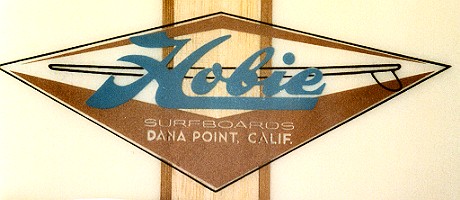
One combination that has stood the test of time is California's
Hobie Alter and his flying H.
However, I don't think any logo has been more successful than
the Lightning Bolt which is of course a speed car symbol.
It's one that everybody identifies with strongly.
That ideally is what most manufacturers are looking for now.
But I think that the difference is that although there are
plenty of symbols around, the test is, can you make that
particular symbol mean something?
Which of course
Gerry Lopez has done quite often.
 |
10. GERRY
LOPEZ WITH THE BOLT
- PROBABLY THE MOST
SUCCESSFUL SURFING LOGO
Substitute |
Board decoration seems to be pretty
much limited to full colours, half colours, pinlines, airbrush,
and within the airbrush category you can get full tip to tail
murals or just the spot, a couple of dolphins leaping on the
nose or something like that.
The pinlines are my personal
favourites, probably because I don't have the patience to do
airbrush.
It takes a very special dedication to put that much time and
effort into the creations that go into really really good
airbrush and to just see them walk out the door, I personally
couldn't do that.
But I guess the people who do these things need the money and
also need the avenue of expression.
At least their work is being appreciated and they're being
allowed to do what they enjoy doing.
The inventor of pinlines is unknown
to me, but I think the idea came from the radical customisation
of hot rods era in the late 40s and early 50s with pinline
specialists in America like Von Dutch who was probably the
empitome of decor masters - flames and scallops and all this
sort of thing on hot rods.
Somebody must have picked up the idea that the cutline that you
get when you lay up the bottom and top of a surfboards glass, might best
be served by turning it into a decoration of sorts.
And so pinlines began with the idea of covering up that cutline
so that it looked a little better, and from there the idea just exploded - two pinlines are better
than one, two pinlines of a different colour is even more exciting, and there it went.
 |
11. SIMON ANDERSON AND
BROTHER MARK DESIGNED
THE UNIQUE WIDE BORDER RAIL LOOK,
BACK AT ENERGY'S
INCEPTION FIVE YEARS AGO.
THE DESIGN AND THE TRIANGLE SUN LOGO
HAS BECOME SYNONYMOUS
WITH THE ENERGY
PRODUCT
AND IS STILL POPULAR IN
1980.
- Substitute
|
In doing a
pinline and colour panel work, you always start out with an
idea, and it's usually a strong idea of what you want to put on
the board as far as the colour and line layout goes, but as soon
as you start putting the tape down, the vision gets very very
foggy because the tape then becomes another set of lines.
You find that you're working in the negative, when you've laid
everything out with the tape you're seeing the negative of what
you're going to put on.
Then when the colour is applied it's always a big wonderful
surprise when you pull the tape off and see what the final
result is.
For me, that makes it always it exciting because you never
really know, even though you have a fairly strong concept
of what's going to come off, you never really know until you do
pull those lines off and trim them up.
I'd then walk away from it and see what else it needs to involve
me further, to make it really work.
Often a stronger line here or another panel there will give it
that completeness that you don't know until you finish it.
For colour combinations and colours on colours, such as colour
lines on a colour, background, it helps to know the person who
the board's going to.
To people who are of a conservative nature you wouldn't give
bright clashing colours, colours that excite.
You'd give them colours that are sedate, that speak of
organisation and composure, that accent the image that they
project.
Unless of course they give you, a directly opposite order.
I always think of what the guy wears, what he drives, how he
speaks and then his surfing style too.
You don't build a turning, super hotdogging board for a guy who
likes to make long running drives.
You would also make long running designs of a fairly simply
nature for this would seem more like the person.
Whereas a hotdogger, a guy who's really out there to
bend it, would of course get
brighter colours, a more broken up design, hotter panel
combinations.
If you can tie the colours in with the guys surfing personality
then once again you're enhancing his abilities visually.
And if you've enhanced it design-wise, you've come a lot closer
to satisfying at least the image that this person projects,
which I'm sure is also the image that he's aware of.
A happy customer is the end
satisfaction, a guy who's pleased all the way around with the
product that, he's purchased.
The idea being to satisfy all the levels of personal need which
of course are physical and mental.
I'm not prepared to say which is the most important of the two.
I personally find the mental is much more important than the
physical because that's where the satisfaction feeling rests, in
the mind, not in the body.
|
|
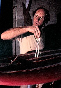
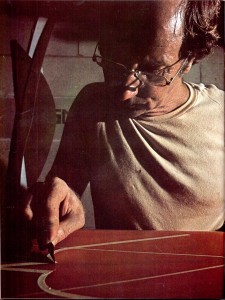
12. COOPER
PULLS THE TAPE.
13.
COOPER PULLS THE TAPE #2.
|
|
|
Bob
Cooper : Colour
Surfing World
Volume 29 Number 2
April 1980
pages 28 to 49
|
Notes
1. Bob Cooper is an expatriate
Californian surfer with extensive surf knowledge.
2. A brief history, design
options and comments on the psychological impact of surfboard
decor.
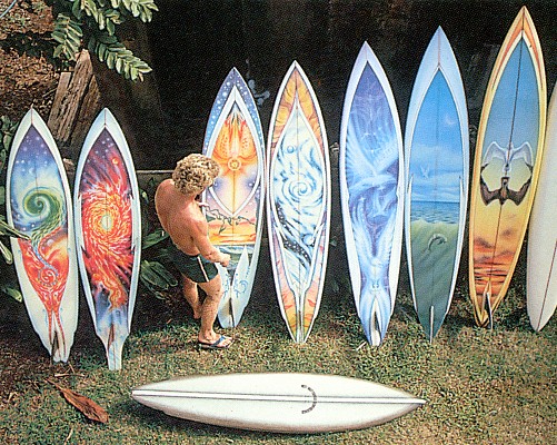
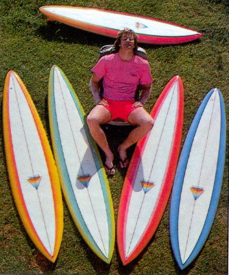
Images
Note : The original article is richly
illustrated with many photographs
and detailed captions.
Also there are several images that
illustrate one design (eg MR, Simon).
Therefore...
- Many are large surfing shots and they
have been largely substituted with board portrait images that are
applicable for other entries in the site.
- The captions have been entered in
roughly to illustrate the text, but for the multi-images these
have been combined and edited.
- Some captions have been deleted.
IMAGE CREDITS
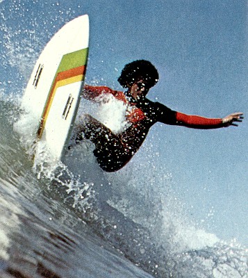
1. COOPER PERSUING HIS
PINLINING PASSION
Surfing World, Volume 29
Number 2 (circa May 1980) page 28
Photograph by Aintionn
2. THE DUKE WITH NAME AND
SURFING CLUB EMBLEM.
Surfing World, Volume
29 Number 2 (circa May 1980) page 30
Uncredited
3. CHRIS BYRNE WITH COMPANY
LOGO - Substitute
Surfing World, Volume
29 Number 4 page 79
Photograph by Aintionn
Original photograph and caption :
PHIL BYRNE WITH COMPANY LOGO AND
SPONSOR
4. MARTYN WORTHINGTON WHO
WITH TERRY FITZGERALD CREATED A WHOLE NEW IMAGE FOR
SURFBOARD DECORATION HERE.
Surfing World, Volume 29 Number 2 (circa May 1980) page
35
5. THE WORK OF GOLD COAST
BASED SHANE EGAN, TRANSLATOR OF FANTASY AND IDEALISM. - Substitute
Surfing World, Volume
26 Number 1 page 77
Photograph by Bruce Channon
6. MARK RICHARDS WITH HIS
SUPERMAN 'MR' LOGO - Substitute
Mark Richards, Merewether
Beach, NSW circa 1979
Surfing World, Volume
28 Number 3 page 64
Photograph by Aintionn
7. LARRY BERLTEMAN WITH HIS
GEOMETRIC DESIGN OF LAST SEASON
Surfing World, Volume
29 Number 2 (circa May 1980) page 46
Photograph by Warren Bolster
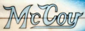
8. THE INSTANTLY RECOGNISED
McCOY LOGO ...- Substituted
surfresearch entries
Original photograph and caption :
MARTY LEE, SHOWING McCOY
DERIVATION AT MAROUBRA. PHOTOGRAPHY TONY NOLAN.
9. COLOUR JUNKIE TERRY
FITZGERALD ALWAYS DRAWING THE NEON LINE.
THE RAINBOW HAS PROVIDED
INSPIRATION FOR A UNIQUE HOT BUTTERED IMAGE. -Substitute
Not Sure
10. GERRY LOPEZ WITH THE BOLT
- PROBABLY THE MOST SUCCESSFUL SURFING LOGO
- Substitute
Gerry Lopez, Pipeline circa
1973
Photograph by Lerner
Surfer Vol 14 # 3
September 1973 page 48
11. SIMON ANDERSON AND BROTHER
MARK DESIGNED
... -
Sustituted
Simon Anderson and Hawaiian
Quiver, Winter 1977.
Surfing World, Volume
30 Number 1 page 28
Photograph by Aintionn
12. COOPER PULLS THE TAPE
Surfing World, Volume
29 Number 2 (circa May 1980) page 49.
Photograph by Aintionn
13. COOPER PULLS THE TAPE #2
Surfing World, Issue
240 (circa May 1995?) page 82
Photograph by Aintionn
This photograph taken circa 1979 in
the same shoot as Image 1, but was not published until 1995.
surfresearch.com.au
Geoff Cater (2000-2021) : Bob Cooper :
Colour, 1980.
http://www.surfresearch.com.au/1980_Cooper_Colour_SW_Mar_v29n2_p28.html